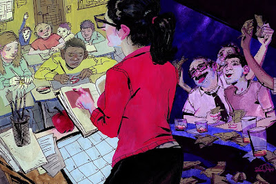
This is an editorial spot for an online magazine. It's a pretty straight forward illustration. Not exactly as conceptual as I'd want it but with time.
If you have any sort of crits, comments or advice I'd greatly appreciate!
Any recommendations for scanning line art? My scans always look jacked!
What kind of scanners do you guys use?


4 comments:
yo rich, nicely executed homie - kind of weird but her ear is beautiful (the rest is too...but that ear man)
the only thing i could offer is if youre going to split the composition up like that maybe try to add some elements to engage the two together and create a 'flow'. right now my eye is stuck in either of the two locations and im having to push my eye along the image to get to the other.
for example, what if her skirt was lowered ever so slightly on the stripper side and a hand was coming from over the bar to grab her bum - that might create an element to lead the viewer to one side to the other. and on the school side maybe a kid was coming up to her table to hand her their quiz / paper / whatever.
maybe elements like that could have helped push the narrative and the design.
beautiful piece though man - great job!
I agree with tyler about adding adding an element to create a flow. However this piece is killer. and that ear is awesome. keep it up!
I like the diversion of color and how it plays into the piece and genrally how you worked that "drawn" kind of feel in. The texture of the paints adds to the snappy linework in ink. I only could get those in the zoomed in version of the piece and they really help the style of coloring. Nice topic!
Scanning and line art, that is an old crux!
The classic solution would be to make two separate color plates: One for the black, so you can both enhance the .dpi to a higher rate in B/W or Greyscale - up to 1200dpi and catch all the details that would be lost on the lesser dpi, as well as make it deep and contrasty so you have a steady black, which could mess with the rest of the colors if both are scanned at once and then worked at.
And one for the color plate that goes in on around 400dpi. Once you got both adjusted, you can put the blacks down to 400dpi and since they are the same scale they will merge together when you overlay them. Well, that's all a bit quick-quick with the explanation and some details are lacking, but you know...
In the old style, the line art was printed in light blue (or for the more patient: Lightboxed) on a special board where you would paint your colors on, so the color adjustment could be done separately from the blacks.
There is a couple of articles on the net about that (+some real experts with it), but heck I can't find them now - sorry!
In Comics when you see real painted colors underneath crisp printed blacks, that is done in that technique. It's not so common now, with all the digi painting and all, but it's still around.
With scanners, I prefer to rather use a smaller, good one of better quality and stick the piece together in PS, than a bigger one that won't come up with good diversity in scanning in depth. Which can leave a lot of the drawings/paintings quality out when it's digitalized (pretty important both in B/W and paint work, I think). Good larger scanners are pain-in-the-ass expensive...
WOW! Now I gnawed off your ear, hehe. Hope I didn't yammer on about stuff that you already heard off. ;)
thanks for the crits guys! I'm glad you brought up the split composition as I spent a lot of time trying to make it work. I'm going to keep this stuffNikki Sinn in mind on the next one.
LOOKA, Dude! thanks for the insight on scanning in blacks separately. I'll Have to try it. I think it could be a fun experiment painting flats in gouache and adding blacks separately. I can always light box the lines back in after to have an original.
Post a Comment